
How Design Impacts E-Commerce Sock Sales
Socks. They're possibly the most mundane product anyone could sell online. No complex specifications. No life-changing features. Just fabric tubes that go on your feet. Yet some e-commerce sock brands are absolutely crushing it, generating millions in revenue, whilst others struggle to shift a single multipack.

The difference? It's not the socks themselves let's be honest, most socks are functionally identical. It's the web design. The way the product is presented, the journey customers take from landing page to checkout, and the visual storytelling that transforms basic hosiery into something people actually want to buy.
If web design can make socks compelling enough to build million-pound businesses, imagine what it can do for products people actually care about. Let's explore how design directly impacts e-commerce sales, using the humble sock as our surprisingly instructive case study.
First Impressions Happen in Milliseconds
Your potential customer has just clicked through from an Instagram ad or Google search. They land on your sock website. Within 50 milliseconds literally faster than they can consciously process what they're seeing their brain has formed an opinion about your site's credibility, quality, and whether to stay or bounce.
Fifty milliseconds. That's how long you have to make a good impression through web design alone.
Professional, modern web design with high-quality imagery immediately signals "legitimate business worth buying from." Cluttered layouts, poor-quality photos, outdated fonts, or clashing colours scream "amateur operation" or worse, "potential scam." Your customer closes the tab before even looking at your products.
Successful sock e-commerce sites understand this intuitively, and they typically collaborate with a web design agency that is familiar with their brand. Brands like Stance or Happy Socks invest heavily in striking visual design that makes you actually want to explore sock options. Clean layouts, bold colours, excellent photography these aren't luxuries, they're essentials that directly impact whether people trust you enough to hand over their credit card details.
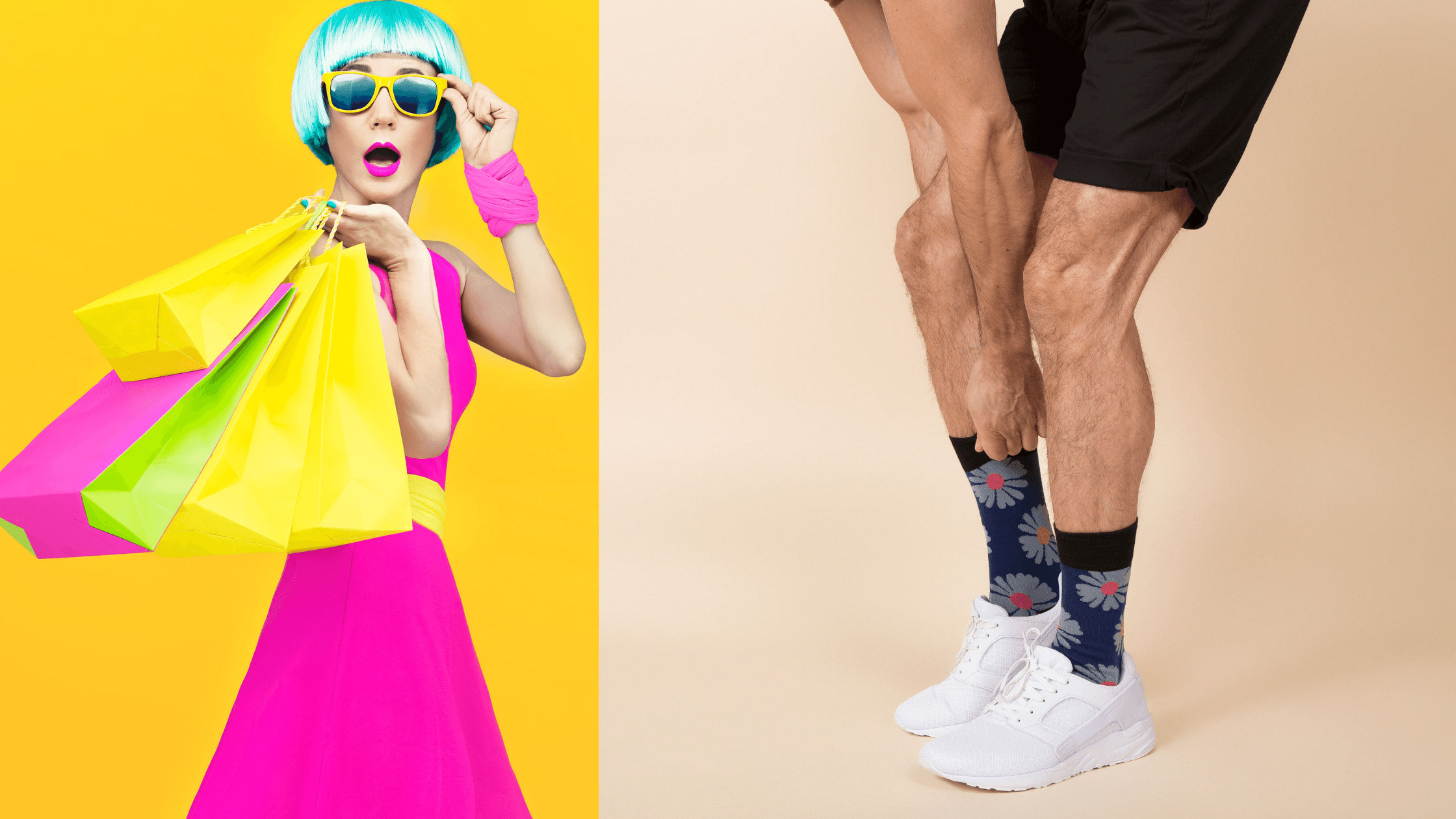
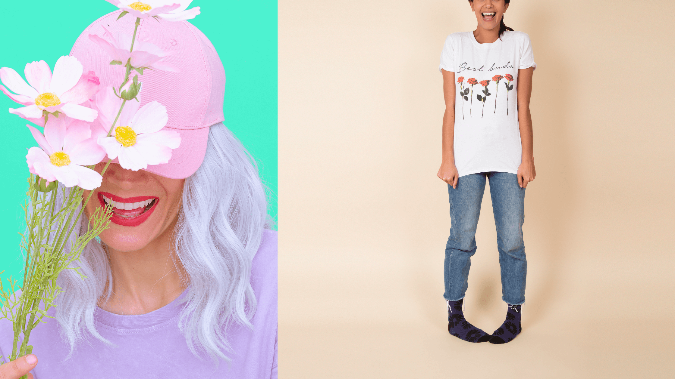
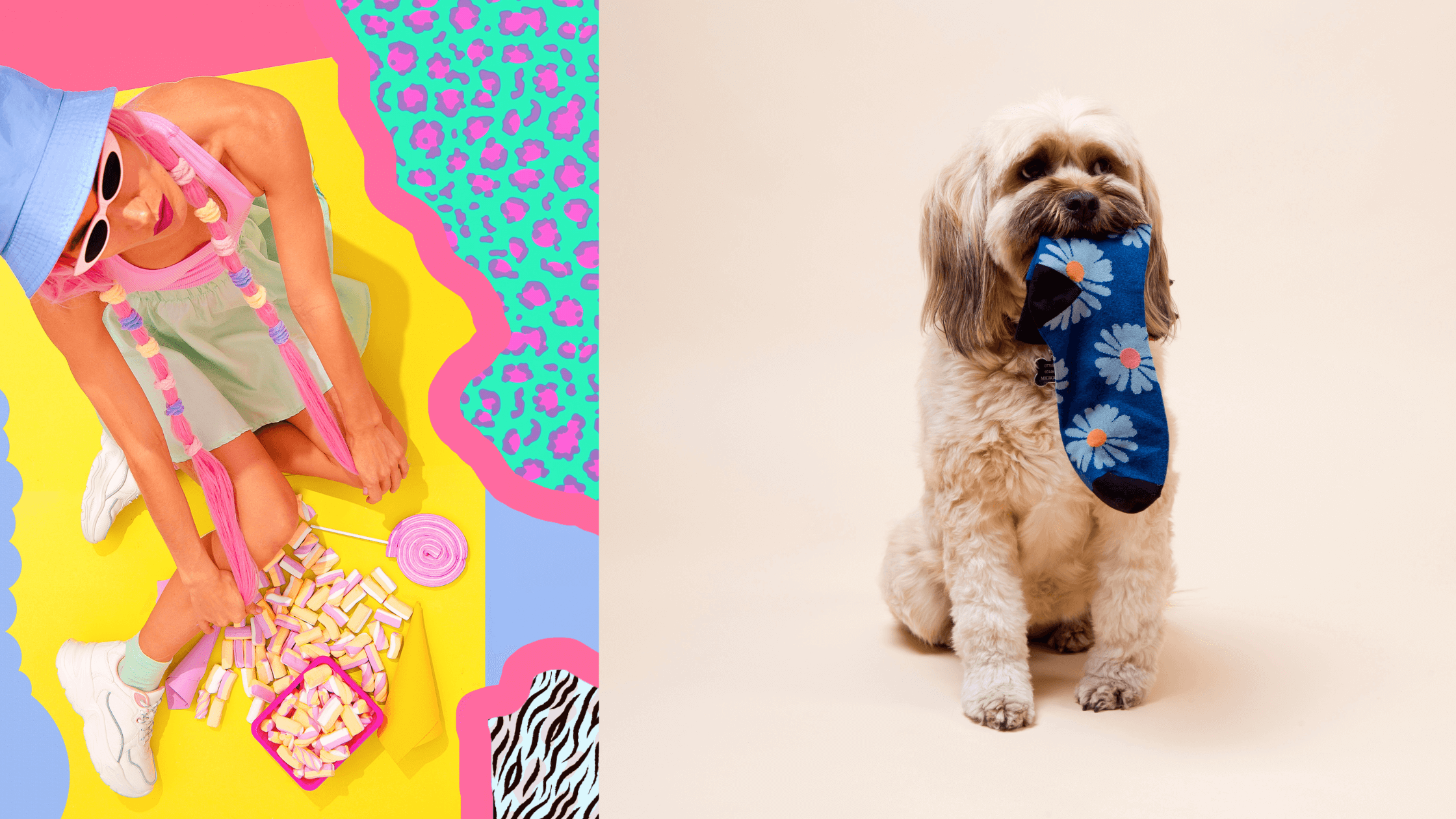
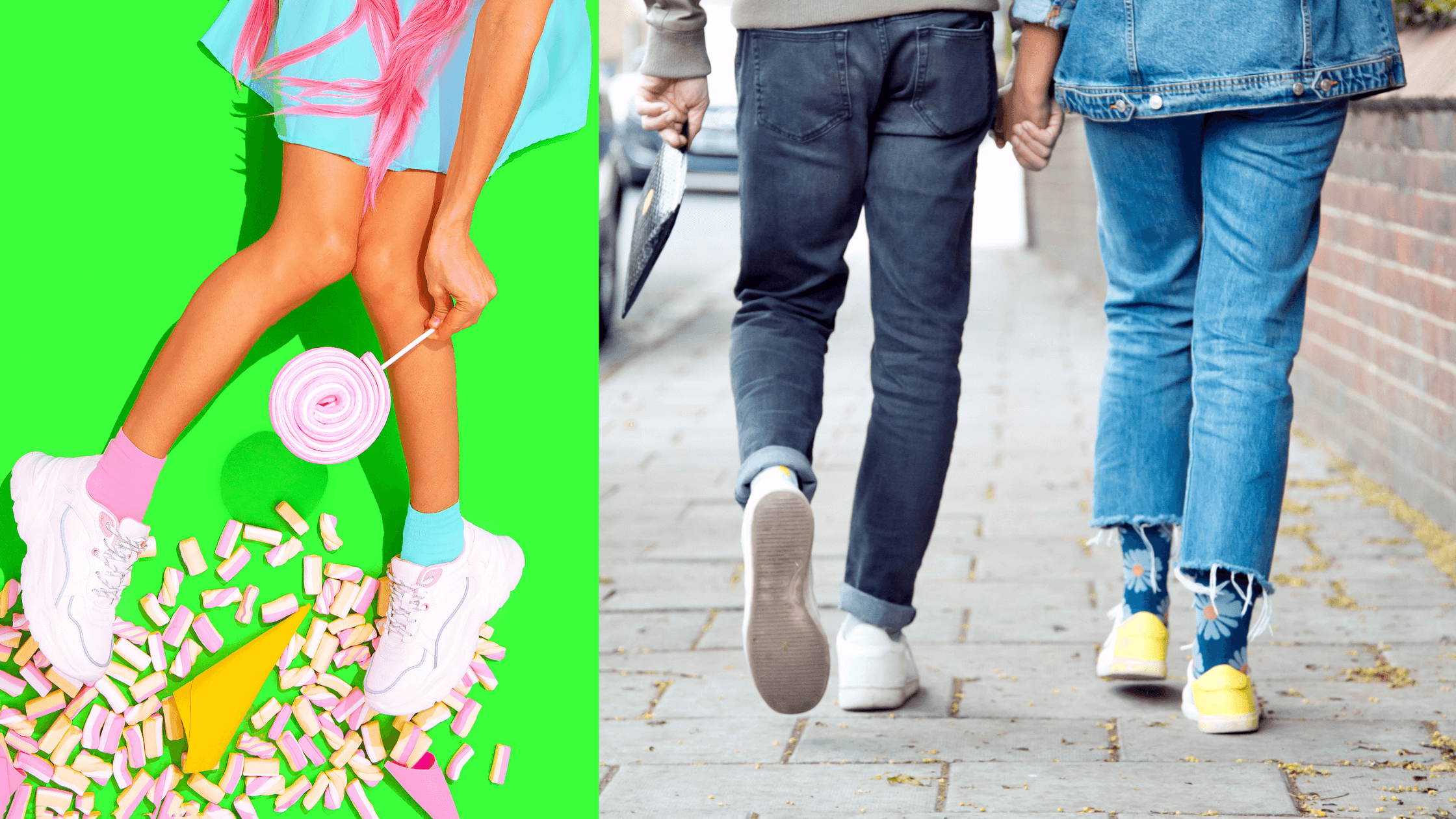
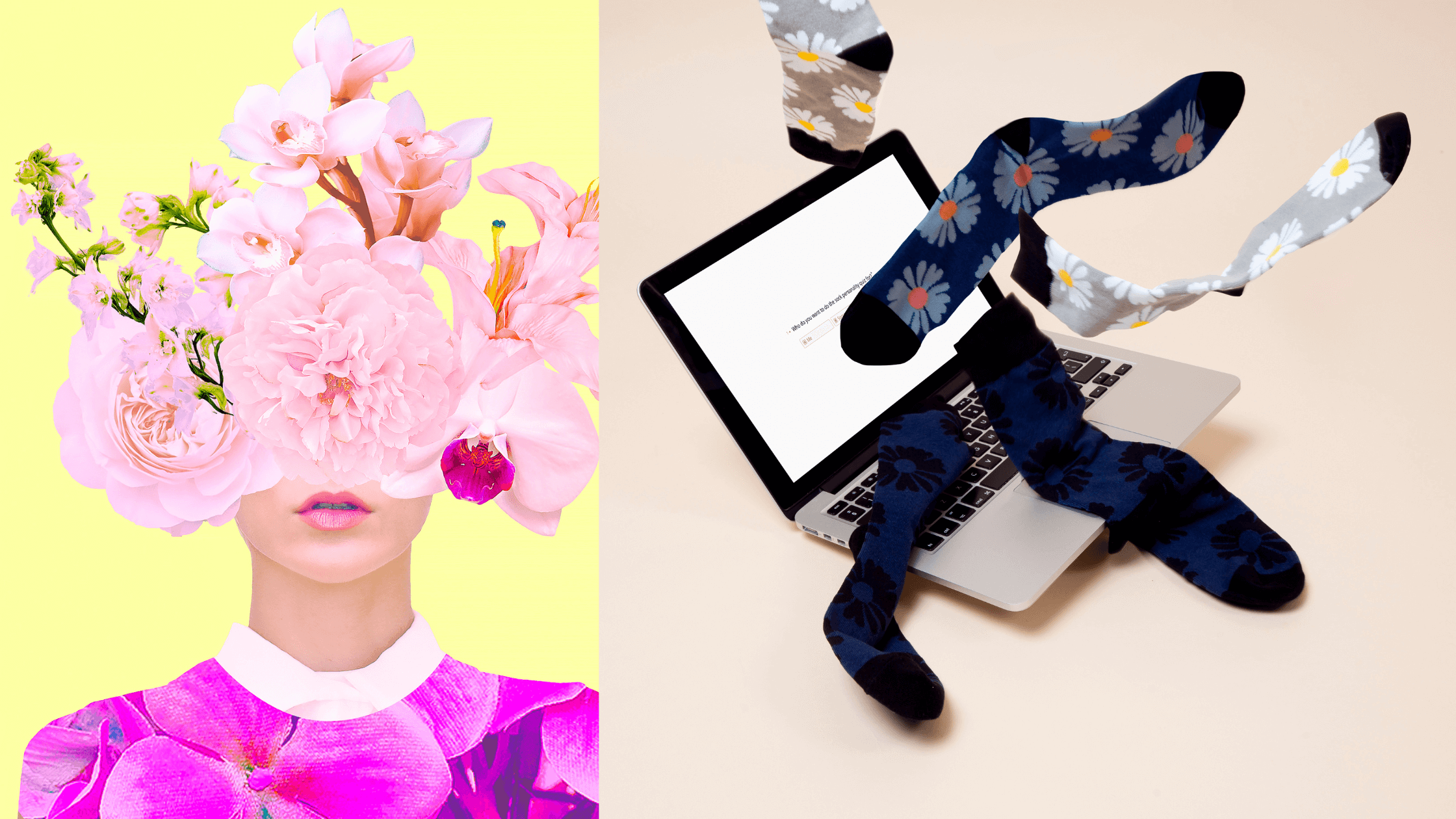
Product Photography That Actually Sells
Here's a truth bomb: nobody gets excited looking at socks laid flat on a white background. Yet countless e-commerce sites, across all product categories, persist with lifeless product photography that does nothing to inspire purchase desire.
Great web design understands that product presentation is everything. Socks worn by models in lifestyle settings suddenly become aspirational. Close-up shots showing texture and quality address unspoken concerns about comfort. Multiple angles give confidence about what customers are actually buying. Zoom functionality lets people inspect details as they would in-store.
Compare two sock products: one photographed flat on a white background, the other shown on a model in an interesting setting with complementary lifestyle imagery. Which converts better? The latter, every single time, despite being the exact same product.
This principle extends across e-commerce. Web design that prioritises compelling product presentation - through quality photography, 360-degree views, lifestyle imagery, even video - dramatically outperforms sites treating product images as an afterthought.
The Psychology of Colour and Visual Hierarchy
Sock companies have an advantage: their products are inherently colourful and visual. But the lesson applies universally - web design that understands colour psychology and visual hierarchy guides customers seamlessly toward purchase.
Contrast matters. Your "Add to Cart" button needs to stand out. If everything on your page is screaming for attention, nothing gets attention. Smart web design creates a clear visual path: the headline draws the eye, the product image holds attention, the price is immediately visible, add-to-cart button is unmissable.
Colour choices influence perception. Premium sock brands often use black, white, and minimal accent colours to signal sophistication. Fun, quirky brands use bright, playful colours. Budget brands might use primary colours and bold fonts. These aren't random aesthetic choices - they're strategic web design decisions targeting specific customer psychology.
White space (or negative space) deserves special mention. Cramming every pixel with content overwhelms visitors. Strategic use of white space creates breathing room, draws focus to what matters, and paradoxically, makes sites feel more premium. Compare any successful sock brand's website to a cluttered competitor, and the difference is striking.
Mobile Experience Isn't Optional
Over 70% of e-commerce traffic now comes from mobile devices. If your web design doesn't work flawlessly on mobile, you're literally excluding the majority of your potential customers.
Mobile-optimised web design isn't just about responsive layouts that adapt to smaller screens. It's about rethinking the entire user experience for touchscreens and limited screen real estate. Large, tappable buttons. Simplified navigation. Fast loading times. Easy-to-complete forms. Frictionless checkout.
Sock sites with poor mobile experiences lose sales at every stage. Images don't load properly. Product details are hard to read. Checkout forms are fiddly and frustrating. Customers abandon their carts and buy from competitors with better mobile web design instead.
This isn't sock-specific it's universal. If your web design doesn't prioritise mobile experience, you're haemorrhaging potential revenue every single day.
Speed Literally Equals Money
Every additional second your website takes to load, you lose customers. Research shows that 40% of users abandon sites that take more than three seconds to load. For e-commerce, where competition is a single click away, speed is absolutely critical.
Web design impacts site speed significantly. Heavy images, bloated code, unnecessary animations, poorly optimised assets these design choices directly affect loading times and therefore conversion rates.
Fast-loading sock websites, even selling commodity products, outperform slow competitors selling superior products. Customers don't care why your site is slow they just leave and buy elsewhere.
Optimising web design for speed means compressing images without quality loss, minimising code, leveraging browser caching, using content delivery networks, and ruthlessly eliminating anything that doesn't directly contribute to the customer journey. These technical web design considerations aren't glamorous, but they directly impact your bottom line.
Checkout Design Makes or Breaks Sales
You've done everything right. Customer has found your socks, added them to their cart, and is ready to buy. Then they hit your checkout page and… abandon. Happens constantly, and poor checkout web design is usually the culprit.
Complicated multi-step checkouts lose customers. Unexpected costs sprang at the final hurdle and loss of customers. Mandatory account creation loses customers. Unclear progress indicators lose customers. Forms requesting unnecessary information lose customers.
Best-practice checkout web design is obsessively simple: guest checkout option, clear progress indication, minimal form fields, transparent pricing including delivery, multiple payment options, and absolutely zero surprises. Each unnecessary click or field reduces conversion rates measurably.
Sock brands with streamlined checkout web design convert significantly more browsers into buyers than competitors with clunky checkout processes. The principal scales: whatever you're selling, the checkout web design directly determines how many people who want to buy actually complete their purchase.
Trust Signals and Social Proof
Buying socks online requires minimal trust they're low-risk, low-cost purchases. Yet even sock sites benefit enormously from web design elements that build credibility: customer reviews prominently displayed, trust badges near checkout, clear return policies, professional "About Us" pages, and real photos of the team.
For higher-value or more considered purchases, these trust signals become absolutely critical. Web design that strategically incorporates social proof, security indicators, guarantees, and credibility markers dramatically improves conversion rates.
User-generated content customer photos wearing your socks is particularly powerful. Web design that showcases real customers validates purchase decisions far more effectively than any marketing copy you could write.
Personalisation Through Design
Advanced e-commerce web design increasingly incorporates personalisation showing different content to different visitors based on their behaviour, location, or preferences.
A returning customer might see previously viewed sock styles. Someone who abandoned their cart might see those specific products highlighted. A visitor from Scotland might see winter socks featured during cold months. This sophisticated web design creates experiences that feel tailored rather than generic.
For small businesses, even basic personalisation like showing "Customers also bought" or "Recently viewed items" improves engagement and sales. Web design that treats every visitor identically misses opportunities to guide them toward relevant products.
The Bottom Line
If thoughtful web design can make socks literally one of the most boring products imaginable into desirable purchases that build multi-million-pound brands, what can it do for your products?
The answer: everything. Web design isn't just about aesthetics. It's about psychology, user experience, trust-building, speed optimisation, and ultimately, conversion. Every design choice either moves customers toward purchase or pushes them away.
Whether you're selling socks, software, or services, investing in professional web design that understands e-commerce principles isn't optional it's the difference between a website that generates revenue and one that just looks pretty whilst making nothing.
Your products might be brilliant. Your marketing might be on point. But if your web design isn't working as hard as you are, you're leaving serious money on the table. Time to change that.


Leave a comment