


Sock design themes explained: the 2026 guide
Sock design themes are defined as the categorisation of motifs, styles, and concepts that designers use to give socks a distinct visual identity. From novelty humour and pet faces to geometric patterns and profession-themed imagery, these categories shape everything from gifting choices to production decisions. Understanding them matters because the theme you choose directly affects which manufacturing method works, how many colours you can use, and whether the final product looks sharp or muddy. Brands like Solos™, VelonSocks, and Sock Geeks each approach sock design themes differently, but all operate within the same creative and technical constraints.
1. What are the most popular sock design themes?
Top-selling sock theme categories include novelty and humour, pet-themed imagery, profession and career motifs, geometric and aesthetic patterns, holiday and seasonal designs, and sports. Each category sells for a different reason, and knowing why helps you choose the right theme for your audience.Here is a breakdown of each major category:
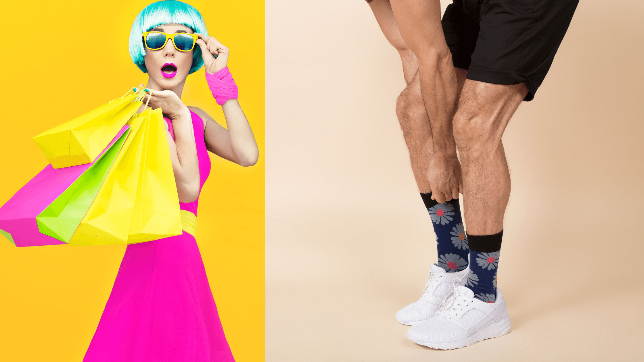
- Novelty and humour. Puns, food illustrations, and absurdist imagery dominate gifting markets. A sock printed with a slice of pizza or a cat wearing sunglasses sells because it triggers an immediate emotional reaction. Humour lowers the barrier to purchase.
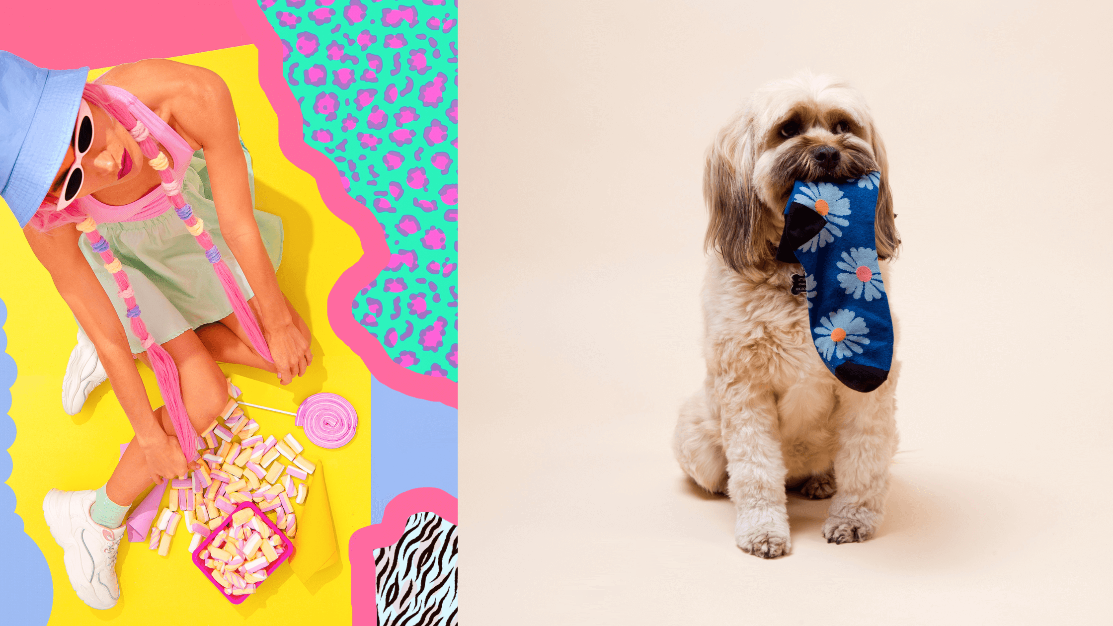
- Pet faces. Pet image socks convert at two to three times the rate of standard patterned socks. The emotional connection between owners and their animals makes these a reliable bestseller, particularly for custom gifting.
- Profession and career themes. Socks featuring stethoscopes for nurses, rulers for teachers, or coffee cups for baristas tap into identity and pride. They work especially well as gifts because they feel personal without requiring the buyer to know the recipient's exact taste.
- Geometric and aesthetic patterns. Argyle, stripes, Fair Isle, and abstract colour-blocking sit in this category. These designs age well and cross gender and age demographics more easily than novelty themes.
- Holiday and seasonal. Christmas puddings in december, pumpkins in october, and hearts in february drive predictable seasonal spikes. Retailers stock these themes months in advance because demand is time-sensitive.
- Sports and outdoor. Football crests, cycling motifs, and hiking imagery appeal to enthusiasts who wear their hobbies literally. These themes perform well as both retail products and branded merchandise.
Pro Tip: All-over prints that use the entire sock surface create a stronger visual impact than small logos on plain backgrounds. Full-coverage designs are consistently associated with higher perceived value.
2. How do manufacturing constraints shape sock design themes?

The method used to produce a sock determines which themes are achievable. Two primary methods exist: knit-in design and sublimation printing. Each has firm limits that directly shape what a theme can look like.
Knit-in design works by converting each pixel of artwork into a coloured yarn stitch. Knit-in designs are limited to approximately 6–7 colours and require bold, simple shapes to reproduce clearly. Fine gradients, hairline text, and photographic detail all fail at stitch scale because the yarn blocks are simply too large to capture them. A geometric stripe or a bold animal silhouette knits beautifully. A detailed portrait of a face does not.
Sublimation printing transfers ink directly onto the fabric using heat. It supports photographic detail and an unlimited colour palette, making it the right choice for pet face socks or complex illustrated themes. The trade-off is durability. Sublimation requires a white or very light base fabric because the white of the sock is the white of the print. Dark base colours are not possible with this method.
| Feature | Knit-in design | Sublimation printing |
|---|---|---|
| Colour limit | 6–7 colours | Unlimited |
| Detail level | Bold shapes only | Photographic quality |
| Durability | High | Moderate |
| Base fabric colour | Any | White or very light only |
| Best themes | Geometric, stripes, simple logos | Pet faces, illustrated novelty |
Zone placement adds another layer of constraint. The ankle cuff is the most visible zone for logos and key motifs. The mid-calf leg offers the largest canvas. The instep and heel distort under stretch, so fine detail placed there often becomes illegible when worn.
Pro Tip: If your theme includes text, keep it to the cuff or upper leg zone. Fabric stretch on the heel and instep will warp letterforms beyond recognition.
3. What design principles keep sock themes visually clear?
Clarity is the single most important quality in sock design. A theme that looks striking on screen can appear cluttered and unreadable on a knitted or printed sock. Three principles prevent this.
Colour hierarchy assigns a clear role to every colour in the design. A controlled colour hierarchy uses one hero colour that dominates, one or two support colours that frame it, and a single accent colour for contrast. This structure stops designs from competing with themselves. VelonSocks uses this approach when translating brand guidelines into production-ready colourways, specifying Pantone values for each role so the factory brief is unambiguous.
Quiet zones are areas of the sock left intentionally free of motifs or heavy pattern. They give the eye a place to rest and make the hero element stand out. Without quiet zones, a busy novelty theme reads as visual noise rather than a coherent design.
Motif scale and placement determine whether a theme lands or disappears. Key design best practices include:
- Keep primary motifs large enough to read at arm's length.
- Place the hero motif on the cuff or upper leg, not the heel or toe.
- Use Pantone colour matching to maintain consistency between digital artwork and physical production.
- Limit accent colours to one per design to avoid visual fragmentation.
- Test the design at actual sock scale before sending to production.
Adapting brand guidelines for sock production requires specifying exact element placement, colour hierarchy, and allowances for knitting distortion. A printed brand guide alone is not sufficient for a factory brief.
4. Can DIY knitters apply sock themes effectively?
DIY knitters can absolutely express sock design themes through hand knitting. The key is choosing techniques that match the complexity of the theme. Stranded colourwork, sometimes called Fair Isle, is the most practical method for embedding motifs into a knitted sock.
Stranded colourwork allows small themed motifs to be worked directly into the sock fabric using two or more yarn colours per row. JaneBurns' watermelon sock pattern is a useful case study. It uses a short stranded section to represent watermelon pips in two colours, keeping the technique manageable for beginner to intermediate knitters while delivering a clear, recognisable theme. The motif is small, bold, and uses high contrast colours. These three qualities are what make it work.Practical tips for DIY theme knitting:
- Limit stranded sections to two colours per row to control tension and avoid puckering.
- Choose motifs with a maximum height of 10–15 stitches to keep them legible at sock scale.
- Use cable patterns or textured stitches for themes that rely on texture rather than colour, such as nautical or botanical designs.
- Colour-blocking, alternating solid colour sections across the leg and cuff, works well for geometric and seasonal themes without requiring complex colourwork.
- Swatch at gauge before committing to a full sock, since yarn substitutions change stitch size and distort motifs.
Embedding a themed motif into a small stranded section with limited colours keeps complexity manageable without sacrificing the theme's visual impact.
Key takeaways
Sock design themes are most effective when the chosen theme, manufacturing method, and colour structure are aligned from the start of the design process.
| Point | Details |
|---|---|
| Theme categories drive sales | Novelty, pet, profession, geometric, seasonal, and sports themes each sell for distinct emotional reasons. |
| Manufacturing method limits themes | Knit-in suits bold, simple designs; sublimation suits photographic or complex illustrated themes. |
| Colour hierarchy prevents clutter | Assign hero, support, and accent roles to colours before production to keep designs clear. |
| Zone placement affects legibility | Place key motifs on the cuff or upper leg; avoid fine detail on the heel and instep. |
| DIY knitters can theme effectively | Stranded colourwork with two colours and small, bold motifs keeps DIY sock themes achievable. |
Why theme and technique must be chosen together
The biggest mistake I see in sock design is treating the theme and the production method as separate decisions. Designers fall in love with a concept, create detailed artwork, and then discover the knitting process cannot reproduce it. The result is a compromised design that satisfies nobody.
The themes that work best are the ones designed with the method in mind from the first sketch. Pet face socks exist as a dominant category partly because sublimation printing made photographic detail on fabric commercially viable. Before that technology was accessible, pet imagery on socks was a blurry approximation. The theme and the technique grew together.
What I find genuinely underexplored is the texture-led theme. Most sock design conversation focuses on colour and motif, but cable knit patterns, ribbing variations, and raised stitch structures can carry a theme just as powerfully. A nautical sock does not need an anchor print if the rope-twist cable running up the leg tells the same story. These designs age better, work across more colour palettes, and avoid the production pitfalls of complex colourwork entirely.
The other area worth more attention is restraint. The instinct in novelty design is to fill every zone. The socks that actually look premium are the ones that leave space. One strong motif, a clean background, and a considered colour palette will outperform a cluttered all-over print every time. Test your design printed at actual sock dimensions before you commit. What reads as bold at A4 size often disappears or crowds at 25 centimetres.
Themed socks worth wearing every day
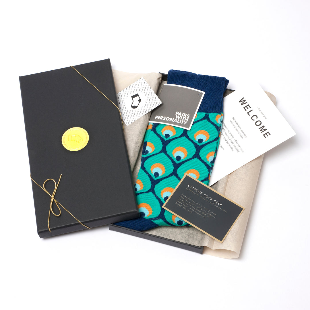
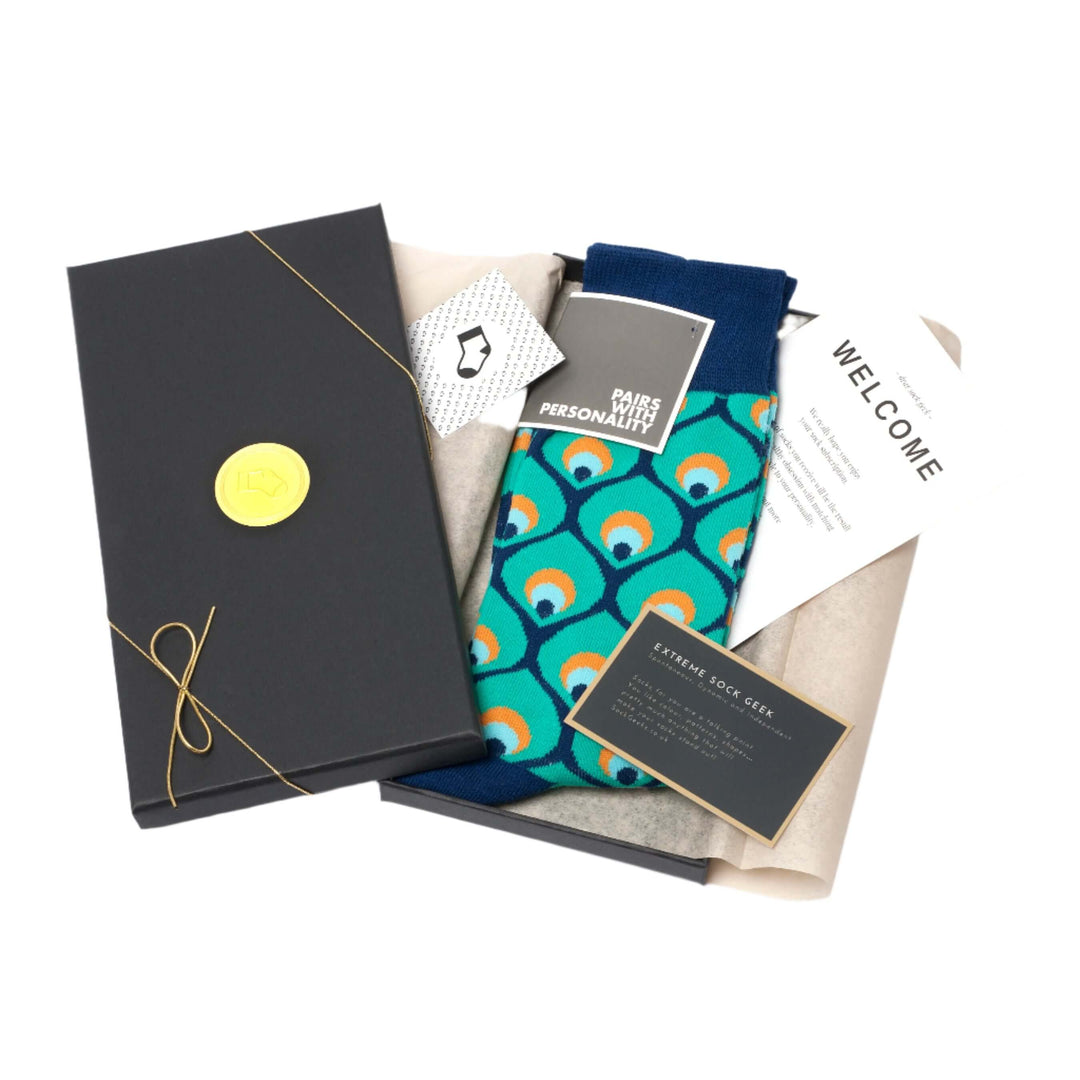
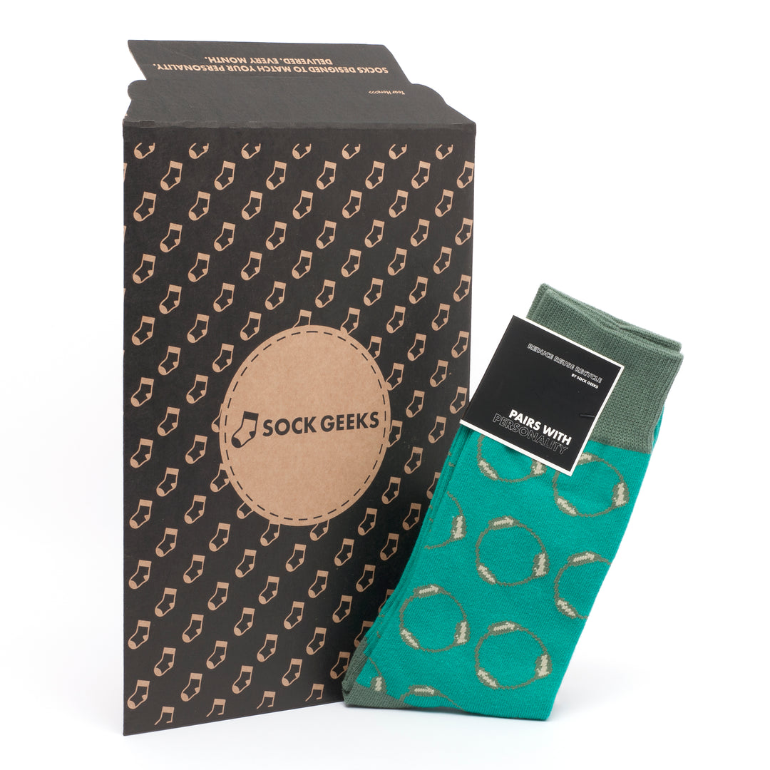
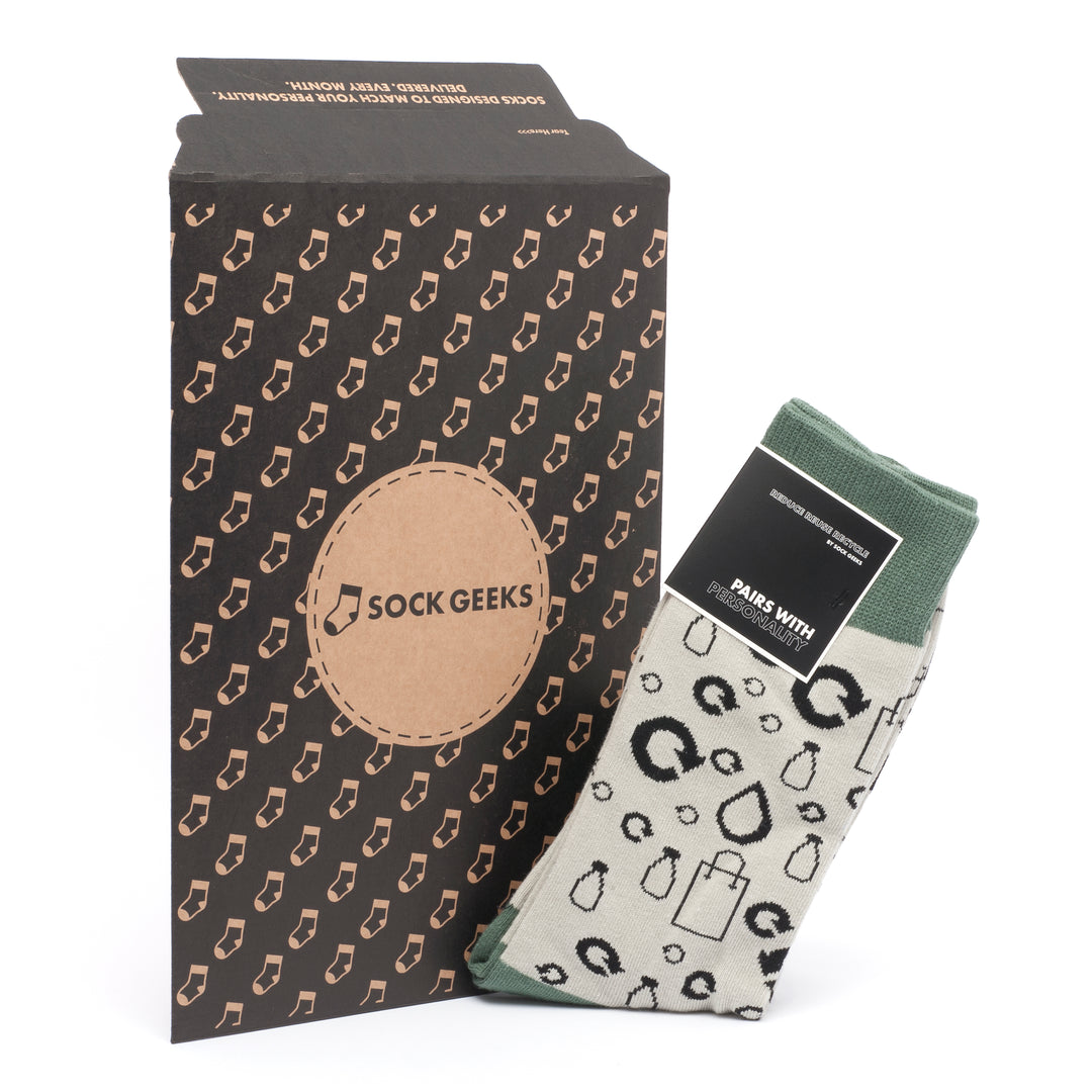
Sock Geeks has been matching people to themed socks since 2016, and the range reflects exactly the categories covered here: novelty designs, wildlife and nature motifs, geometric patterns, and seasonal collections, all made from quality materials.
The Sockgeeks subscription service takes the guesswork out of finding socks that suit your personality. A free online quiz matches your character traits and interests to curated designs, so every delivery feels genuinely personal rather than generic. Gift boxes are available for themed collections across science, art, and wildlife, making them a practical choice for birthdays, Father's Day, and Christmas. Whether you are after a single pair or a year of monthly deliveries, Sockgeeks offers themed socks that are worth wearing.
FAQ
What are sock design themes?
Sock design themes are defined categories of motifs, styles, and concepts used to give socks a distinct visual identity. Common categories include novelty and humour, pet faces, profession themes, geometric patterns, and seasonal designs.
Which sock design theme sells best?
Pet face and novelty themes consistently rank as top sellers, with pet image socks converting at two to three times the rate of standard patterned socks due to strong emotional connection.
What is the difference between knit-in and sublimation sock designs?
Knit-in designs are limited to 6–7 colours and suit bold, simple motifs. Sublimation printing supports photographic detail and unlimited colours but requires a white or very light base fabric.
How many colours should a sock design use?
For knit-in production, limit designs to 6–7 colours to maintain clarity and manufacturability. Sublimation printing removes this restriction but introduces base fabric limitations.
Can beginners knit themed socks at home?
Yes. Using stranded colourwork with two colours per row and small, bold motifs keeps themed sock knitting manageable. The JaneBurns watermelon sock pattern is a practical starting point for beginner to intermediate knitters.


Leave a comment