



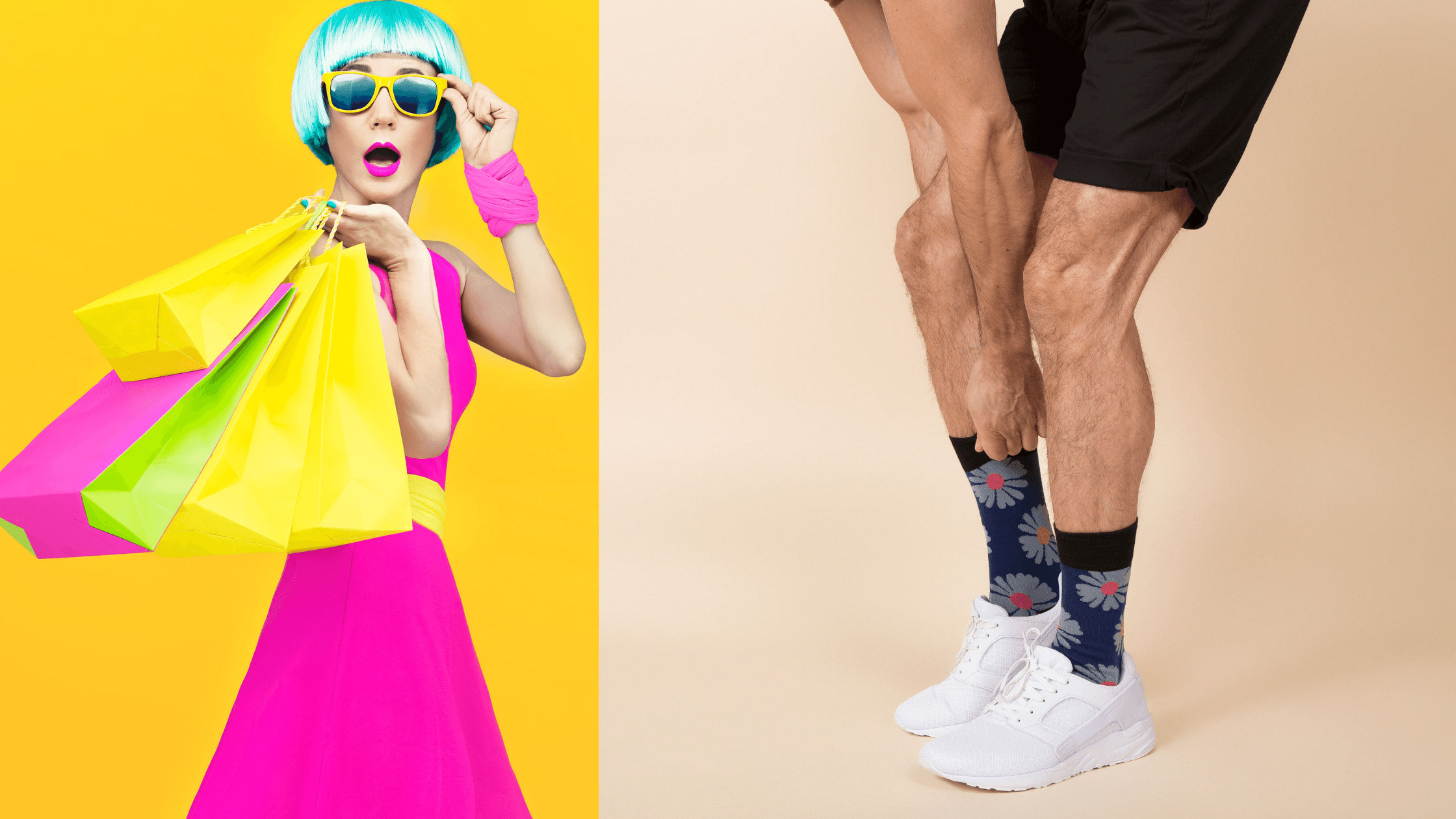


Wearable sock art is defined as the integration of artistic design with the practical demands of fashion, comfort, and durability. What makes sock art wearable comes down to three pillars: how the design is produced, how it accounts for fabric stretch and anatomy, and how it is styled as a deliberate fashion accessory. Techniques like jacquard knitting and sublimation printing each shape the final result differently. Colour systems such as Pantone matching determine whether a design survives the wash cycle looking as good as it did on screen. Get these elements right, and a sock stops being an afterthought and becomes the most interesting part of an outfit.
What makes sock art wearable: production methods that matter
The production method is the single biggest factor in whether sock art holds up visually and physically over time. Two techniques dominate the field: jacquard knitting and sublimation printing. Each has a distinct set of strengths, and choosing between them shapes everything from colour range to how the sock feels against the skin.
Jacquard knitting integrates 6–7 yarn colours directly into the fabric structure, stitch by stitch. That means the design is not sitting on top of the fabric. It is the fabric. The result is a sock that resists peeling, cracking, and fading far better than any surface print.
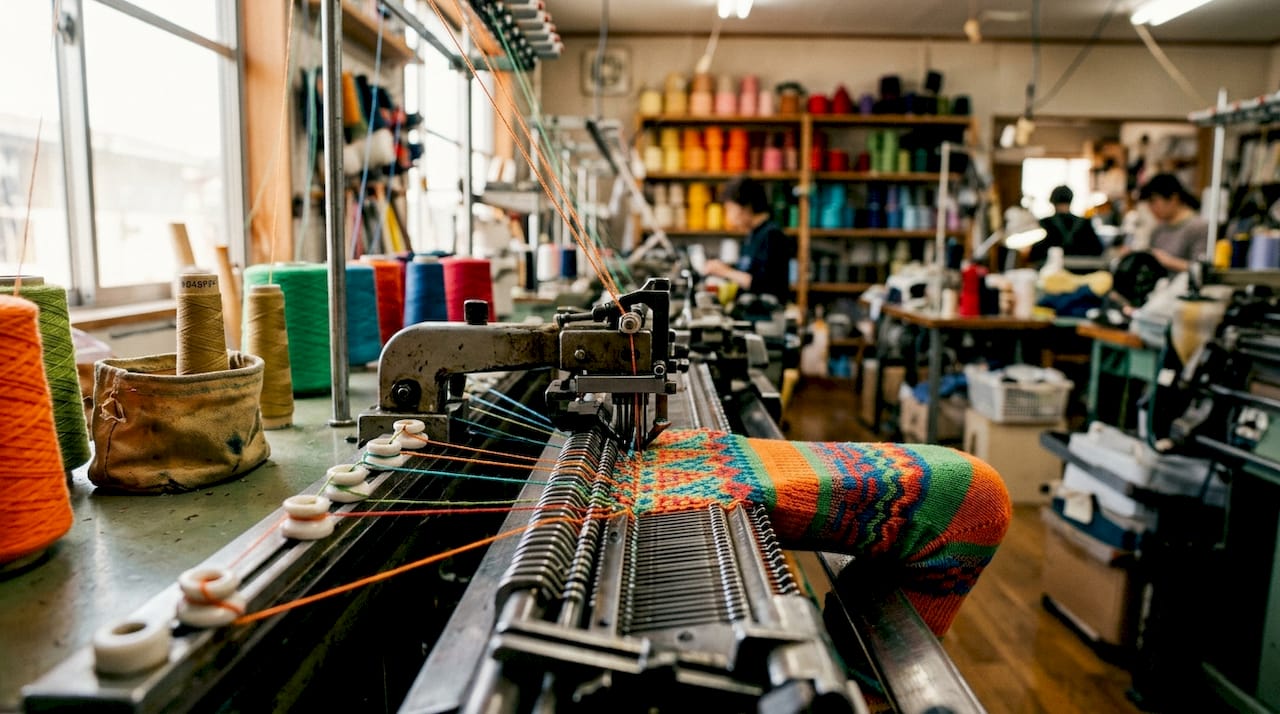
Knitted logos build into fabric structure, which delivers superior comfort and durability compared to embroidery or printing techniques that sit atop the weave. This matters because socks endure constant friction, stretching, and washing. A design that is part of the knit survives all three.
Sublimation printing takes a different approach. It bonds dye directly into polyester fibres using heat, which allows photographic detail and near-unlimited colour gradients. The trade-off is longevity. Sublimation prints fade faster than knit-in designs, particularly with repeated washing at higher temperatures.
| Feature | Jacquard knitting | Sublimation printing |
|---|---|---|
| Colour range | Up to 6–7 yarn colours | Near-unlimited gradients |
| Design detail | Bold, geometric, graphic | Photographic, fine detail |
| Durability | High, wash-resistant | Moderate, fades over time |
| Fabric feel | Soft, integrated | Can feel stiffer on surface |
| Best for | Logos, patterns, bold art | Photo prints, complex imagery |
Vector artwork files (.ai, .eps, .svg) with Pantone or hex colours are non-negotiable for clean, reproducible results at scale. Raster files or screenshots produce jagged edges because knitting machines rely on vector paths to programme needle movements accurately. Pantone colour codes give manufacturers a precise reference point, so the red in your design matches the red in the finished sock.
Pro Tip: Always request a physical sample before committing to a full production run. Digital proofs look different on screen than they do knitted into yarn or printed onto polyester.
What design principles keep sock art visually effective?
Fabric stretch is the enemy of fine detail. When a sock is pulled over a foot and ankle, the fabric distorts unevenly. Fine geometric lines and photographic faces warp badly under this tension, while organic shapes and abstract patterns tolerate the movement far better. This is not a minor consideration. It is the difference between a design that reads clearly from across a room and one that looks like a smudge.
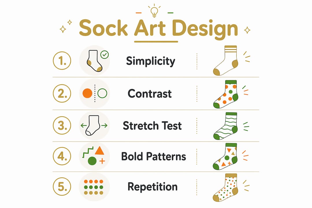
The core design principles for wearable sock art are:
- Bold contrasts over fine gradients. Small details disappear from distance; high contrast keeps the design readable whether the sock is scrunched at the ankle or pulled up to the calf.
- Repeating patterns over single focal points. A repeating motif, such as a geometric tile or a scattered illustration, reads well at any stretch level. A single centred image depends entirely on perfect placement and zero distortion.
- Abstract and organic shapes over rigid geometry. Circles, waves, and irregular forms flex with the fabric. Straight lines and sharp angles reveal every millimetre of stretch.
- Placement away from structural tension points. Elements placed near the heel, toe, or seams distort due to the structural tensions at those anatomical points. Centring the main design on the calf or mid-foot reduces distortion significantly.
Understanding sock art design principles also means knowing what to leave out. Overcrowded compositions lose legibility fast. A design that looks detailed and impressive flat on a screen often becomes visual noise once stretched over a foot in motion.
Pro Tip: Test your design by printing it on a piece of stretchy fabric and pulling it in multiple directions before finalising. What survives the stretch test will survive the sock.
How can creative styling make sock art work every day?
Treating socks as deliberate accessories rather than afterthoughts is the mindset shift that separates creative sock fashion from an accidental outfit. Treating socks as deliberate accessories creates a cohesive look that feels considered rather than casual. The sock becomes a punctuation mark in the outfit, not a footnote.
The most effective styling approach for wearable sock art follows a high-low logic. Here is how to apply it:
- Pair statement socks with polished footwear. Scrunched socks with loafers, pumps, or slingbacks create a quiet luxury effect. The contrast between the refined shoe and the expressive sock reads as intentional rather than mismatched.
- Use colour coordination to anchor the look. Pick one colour from the sock design and echo it in another part of the outfit, whether that is a belt, a bag, or a jacket lining. This technique makes the sock feel like part of a system rather than a standalone novelty.
- Scrunch deliberately. Scrunching a sock down to the ankle exposes more of the design and signals that the choice was intentional. A perfectly pulled-up sock hides the art. A controlled scrunch frames it.
- Match sock tone to shoe tone for a quieter statement. If the sock features warm terracotta tones, a tan leather loafer ties the look together without competing. This approach suits formal or workplace settings where bold contrast might feel out of place.
- Adjust for season and occasion. Sheer or lightweight artistic socks work well with summer sandals and cropped trousers. Thicker knit-in designs pair naturally with winter boots and rolled-up jeans. Seasonal awareness keeps the look grounded in reality rather than costume.
Styling fun socks with any outfit is less about following rules and more about committing to the choice. Hesitation shows. Confidence in a bold sock reads as fashion fluency. The sock is not a risk. It is the detail that makes the outfit memorable.
The key rule for creative sock fashion: let the sock lead one element of the outfit and let everything else follow. Do not compete with the sock. Complement it.
What materials and colours make sock art last?
Material choice determines both how a design looks and how long it survives regular wear. Polyester-heavy blends are the standard base for sublimation printing because the heat-dye process bonds to synthetic fibres. Cotton and premium fibre blends suit jacquard knitting, where the yarn itself carries the colour. Each fabric type has a direct effect on comfort, durability, and how the finished design reads on the foot.
| Material | Best for | Comfort level | Design vibrancy | Durability |
|---|---|---|---|---|
| Polyester blend | Sublimation printing | Moderate | Very high initially | Moderate, fades |
| Cotton blend | Jacquard knitting | High | Strong, stable | High, wash-resistant |
| Premium fibres (cashmere, merino) | Knit-in luxury designs | Very high | Rich, deep tones | High with care |
Colour contrast is the single most reliable predictor of whether a sock design remains legible after repeated washing. High colour contrast and fewer colours maintain clarity after wear and washing. Complex colour schemes look busy and fade unevenly. A design built on two or three strong, contrasting colours holds its visual impact far longer than one using eight subtle shades.
Manufacturers work from yarn colour libraries and Pantone matching systems to ensure consistency between design files and finished product. This matters most in jacquard knitting, where each yarn colour is a physical thread loaded onto the machine. Requesting Pantone-matched yarns reduces the gap between what the designer intended and what the wearer receives. Knowing how to spot high-quality sock designs starts with understanding whether the colours in the finished product match the original specification.
Bold contrasts and repeating patterns also serve a practical function beyond aesthetics. They ensure the design remains readable in motion, which is when socks are actually seen. A sock that looks striking while someone is walking is a sock that works as fashion.
Key takeaways
Wearable sock art succeeds when production method, design principles, material choice, and styling work together as a single system rather than independent decisions.
| Point | Details |
|---|---|
| Production method defines durability | Jacquard knitting outlasts sublimation printing for long-term design clarity and wash resistance. |
| Design must account for stretch | Bold, abstract, and repeating patterns survive fabric distortion far better than fine lines or photographic faces. |
| Placement avoids tension points | Centring designs on the calf or mid-foot prevents distortion caused by heel, toe, and seam tension. |
| Styling requires intention | Pairing statement socks with polished footwear and coordinating colours makes the sock a deliberate fashion choice. |
| Fewer colours last longer | Limiting the palette to two or three high-contrast colours improves both visual longevity and wash resistance. |
Why sock art is more demanding than it looks
The most common mistake I see from people new to creative sock fashion is treating the sock as a flat canvas. It is not. A sock is a three-dimensional, constantly moving surface that stretches, compresses, and folds differently on every foot. Designs that look perfect in a flat mockup regularly fall apart in wear, and the reason is almost always the same: the designer did not account for what happens to the artwork once it is on a body.
What I find genuinely underappreciated is how much the choice of production method shapes the creative brief itself. If you are working with jacquard knitting, you are designing within a colour limit of 6–7 yarns. That constraint is not a restriction. It is a creative discipline that tends to produce stronger, more wearable designs. The best sock art I have encountered almost always comes from designers who understood the production method before they picked up a pencil.
Styling is where most people underestimate their own instincts. The high-low pairing of a bold artistic sock with a clean, classic shoe is not a complicated technique. It is just confidence applied to footwear. The sock does not need to match the outfit. It needs to belong to it. There is a difference, and once you feel it, you cannot unsee it.
For anyone building a wardrobe around men’s sock fashion trends or exploring creative sock fashion for the first time, my honest advice is this: start with one strong design, one great pair of shoes, and let the rest of the outfit be quiet. The sock will do the work.
Artistic socks worth wearing, from Sock Geeks
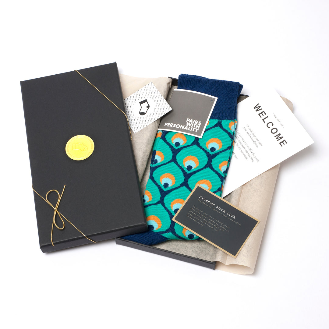
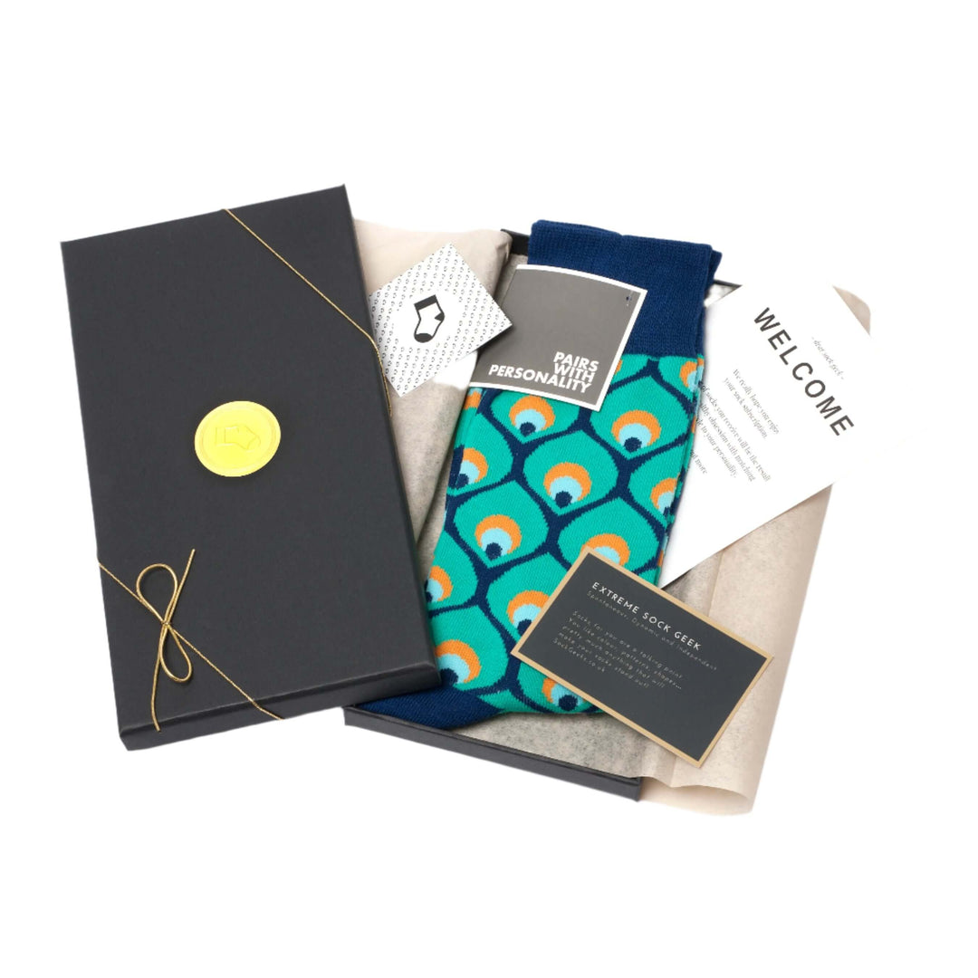
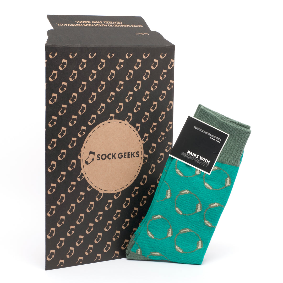
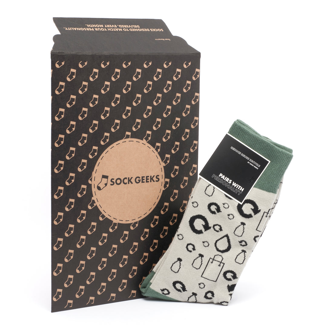
Sock Geeks produces artistic sock designs that are built to be worn, not just admired. Every pair is made from ethically sourced, premium materials, with designs that apply the same principles covered here: bold contrasts, considered placement, and production methods that hold up wash after wash.
Whether you are looking for a unique gift box for someone with a strong sense of style, or building your own collection of wearable sock art, Sock Geeks offers curated options across a wide range of occasions and aesthetics. The personality quiz matches you to designs that suit your taste, so every pair feels chosen rather than random. Sock Geeks holds a 4.72 customer rating, built on quality, originality, and designs that genuinely stand out.
FAQ
What is sock art?
Sock art is the application of artistic design, including illustration, pattern, and graphic motifs, to socks as a wearable fashion medium. It combines aesthetic intent with the practical demands of comfort and durability.
What production method is best for wearable sock art?
Jacquard knitting is the most durable method, integrating up to 6–7 yarn colours directly into the fabric structure for designs that resist fading and peeling through repeated washing.
Why do some sock designs distort when worn?
Fabric stretch distorts fine geometric lines and photographic faces unevenly. Abstract patterns, bold contrasts, and repeating motifs tolerate stretch far better and maintain visual clarity during wear.
How do you style artistic socks as a fashion statement?
Pair statement socks with polished footwear such as loafers or pumps, scrunch them deliberately to expose the design, and echo one colour from the sock in another part of the outfit for a cohesive look.
How many colours should a sock art design use?
Two to three high-contrast colours produce the clearest, most durable results. Complex multi-colour schemes fade unevenly and lose legibility after repeated washing.





Leave a comment